Branding a Channel
Branding Channel pages lets you stylise it to match the branding for a client or one our own stylised channels. It helps with better Customer recognition, consistency, and credibility.
Branding a Channel
Before you can brand a channel it's best to create an unbranded one first so you have an entity to work with. To do this follow our guide on creating a Channel.
The Standard channel header style is used by default and this is what it looks like:
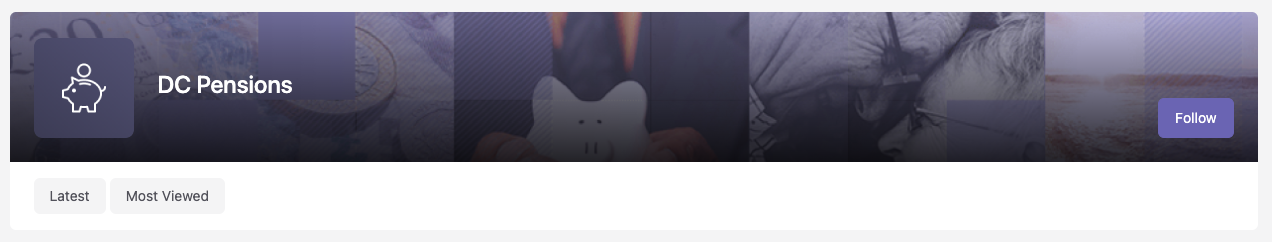
It contains a logo, the channel name, a header image, a follow button, and tabs. The channel name, follow button and tabs are optional and can be turned off if you don't want them.
The next steps are all optional, but you'll need to pick and choose based on which elements you want to add.
Primary Details
On the Primary Details tab you need to add a Logo and Channel Directory Thumbnail.
- The Logo is in a square ratio and more details on the format can be found in the helper text. It's mainly used for in the channel header, but also in the mega menu dropdowns (the large dropdown sections of the menu), and in sidebar widgets.
- The Channel Directory Thumbnail is used on the channel directory page as the channel's thumbnail. It will also be used on other grid layouts such as in search results. Try and keep the styling similar to other channels, you'll be able to see it by visiting the channel directory.
Branding US & Canadian Channels
The US & Canada have an extra field for a Desktop logo. This is in a 16:9 ratio and is used in the header of the channel page when on desktop. This field is optional, and is for wider logos.
Style
The next set of fields to complete are located in the Style tab and cover: colours, the header and background.
- The Hide channel name in header checkbox allows you to toggle whether the channel name (and gradient overlay) shows on the channel header.
- Colour Scheme allows you to set 2 colours, the top one is the primary colour and is used for highlights and buttons on the page. The bottom one is the secondary colour and is used for alert messages that appear on the page.
- Channel Banner sets the header graphic for the page. It is shown as the background of the header with the name of the channel showing on top along with the logo, website, linkedin and follow buttons if they've been set.
- Background Takeover Image sets the background of the channel. The image used fills the background and goes behind all the content. Try not to use something that will distract from the main content where possible.
Styling US & Canadian Channel Headers
The US & Canada have an extra field for removing the gradient overlay from the header. This is useful if you want to use a header image that has a lot of colour in it, or the gradient clashes with the design. The field is called Hide Header Gradient and is a checkbox.
Elements
The elements tab allows you to add Leaderboards and Sidebar Widgets to a channel. For more information on how to do this look at the guides on Sidebars and Leaderboards.
Social Links
Currently you have the ability to add a few social links for a channel. These appear in the bottom right of the channel header. You can add them by going to the Promotion tab, then the Social Media sub tab.
At the moment they contain links to:
- LinkedIn - this link has to be a link to either a company, person, or other page on LinkedIn specifically as the icon that appears is for LinkedIn.
- Website - this can be a link to a website or page on a website. The icon that appears is a generic globe icon.
At the moment these are the only links that can be added to the header of a channel.
Channel Brand Guidelines
For more information on the formatting for graphics take a look at the field descriptions or the Channel Brand Guidelines.